


| Version 1 (modified by peterc, 10 years ago) |
|---|
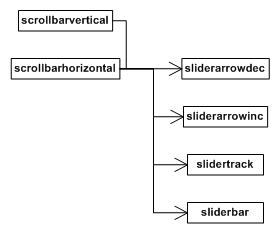
Element scrollbars
When appropriate, Rocket automatically generates hidden scrollbar elements for elements with content overflow. The size and positioning of the scrollbar elements can be influenced through RCSS properties. Custom elements can make use of the scrollbar functionality to generate scrollbars of their own.
Hidden elements
Scrollbar elements are tagged scrollbarvertical or scrollbarhorizontal depending on their orientation, and are parented directly to the elements that generated them. Each scrollbar element contains four hidden child elements:
- sliderarrowdec: The button at the top (or left) of the scrollbar which can be clicked to scroll further up (or to the left) the element.
- sliderarrowinc: The button at the bottom (or right) of the scrollbar which can be clicked to scroll further down (or to the right) the element.
- slidertrack: The track that runs between the two arrow buttons.
- sliderbar: The bar that runs on the track. It represents the size and position of the visible segment of the element's content. It can be dragged to scroll the visible window around.
When both horizontal and vertical scrollbars are present on an element, they are both shortened by the amount necessary to avoid an intersection. Another element is created and placed in this intersection point, placed and sized appropriately. This corner element is tagged scrollbarcorner and exists only for decoration purposes.
Applying RCSS properties
All of these elements can be styled through RCSS to be sized, positioned and rendered appropriately. The recommended method for configuring a scrollbar is given below (note that this is for a vertical scrollbar; for a horizontal, swap width and height):
- Set the 'width' property of the scrollbarvertical element to the appropriate value for your interface design. This needs to be enough to encompass
- Set the 'width' and 'height' properties of the sliderarrowdec and sliderarrowinc elements as appropriate. Set them to '0' if you don't want buttons.
- Set the 'width' property of the slidertrack as appropriate. The 'height' value will be ignored for the track and will always be set internally. Use 'margin-left' to position the track within the scrollbar.
- Set the 'width' property of the sliderbar as appropriate. The height of the bar will be generated internally, but you can override this with the 'height' property, or use the 'min-height' and 'max-height' properties to influence it.
- Apply decorators to the elements as appropriate.
See the Rocket Invaders from Mars demo style sheet and the templating tutorial for more pointers.
The 'scrollbar-margin' property
As described above, the scrollbar elements (scrollbarvertical and scrollbarhorizontal) will shorten themselves automatically to avoid a corner intersection. This can lead to scenarios where a scrollbar is popping on and off (during a window resize, for example) and causing the other scrollbar to rapidly change size. To avoid this, and force a scrollbar to always shorten itself for a corner, you can use the numerical 'scrollbar-margin' property on a scrollbar element. An element will shorten itself (on the bottom or right side, as appropriate) by the minimum of the appropriate corner dimension and the scrollbar margin.
Generating scrollbars
Custom elements can generate scrollbars using the element's scroll interface. This is done, for example, by the text area form control in the Controls plugin.
Scrollbar generation is usually done in a custom element in response to the "resize" event, sent during layout. To retrieve a pointer to an element's scroll interface, call GetElementScroll() on the element. This will return a Rocket::Core::ElementScroll object.
/// Returns the element's scrollbar functionality.
/// @return The element's scrolling functionality.
Rocket::Core::ElementScroll* GetElementScroll() const;
To enable or disable one of the element's scrollbars, call EnableScrollbar() or DisableScrollbar():
// Enables and sizes one of the scrollbars.
// @param[in] orientation Which scrollbar (vertical or horizontal) to enable.
// @param[in] element_width The current computed width of the element, used only to resolve percentage properties.
void EnableScrollbar(Rocket::Core::ElementScroll::Orientation orientation, float element_width);

// Disables and hides one of the scrollbars.
// @param[in] orientation Which scrollbar (vertical or horizontal) to disable.
void DisableScrollbar(Rocket::Core::ElementScroll::Orientation orientation);
As the object will remember the state of both previous scrollbars, it is recommended you explicitly enable or disable both scrollbars.
Call FormatScrollbars() once you have set the state of both scrollbars and set the size (and content size) of the scrolling element.
// Formats the enabled scrollbars based on the current size of the host element.
void FormatScrollbars();